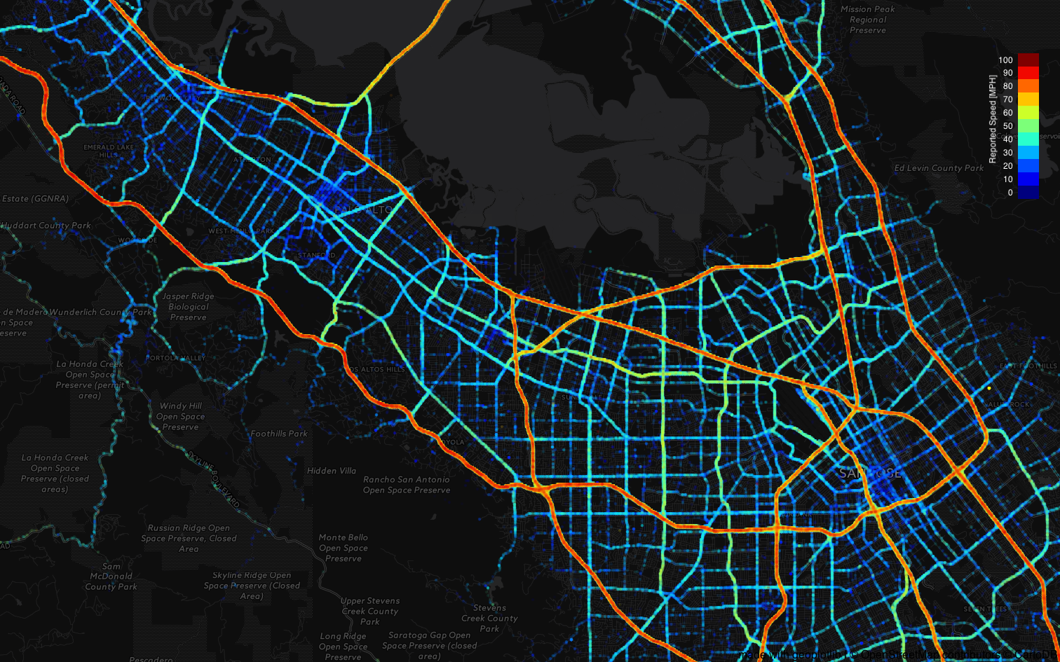
This map shows the average speed in the rough geographic area of my commute. I built this visualization to explore good routes to get to the office. This shows the data collected from waze over a month.

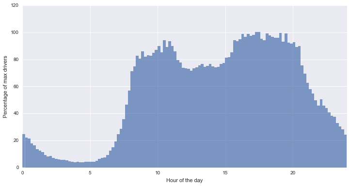
In terms of low hanging fruit with this dataset, I found that I am happy leaving around 7-8am to limit dealing with too much traffic. Likewise, the return commute is much larger than I expected going from 4pm past 8pm.